Why is Visualization so Important in Business Intelligence?

In a marketplace that is continually adding, developing and implementing new digital and virtual tools that collect and analyze information, the importance of data visualization continues to grow as businesses attempt to understand their own spreadsheets, customer insights and marketplace research quickly and accurately. However, the global adoption rate of business intelligence — the strategies and techniques companies use to analyze and manage business information — is only 26 percent.
That means that 74 percent of today’s working professionals are either untrained or unwilling to implement business intelligence solutions, which has a direct impact on company efficiency, profits and innovation. For example, companies with CEOs who make data-driven decisions are 77 percent more likely to exceed their business goals in significant ways and 59 percent more likely to find actionable insights in their analytics. Additionally, the average return on investment for organizations that implement business intelligence and analytics solutions is 1,300 percent.
And yet, only 32 percent of business executives say they are capable of creating measurable value from data, and only 27 percent of business executives say their data and analytics provided their teams with actionable insights.
In other words, the majority of companies and executives are missing out on business intelligence assets such as the benefits of data visualization. Without the right data visualization tools and a strategic approach to data gathering and analysis, organizations and their leaders are left with large datasets and disjointed analytics that fail to provide meaningful insights or solutions. But organizations can grow and innovate in powerful ways when their leaders implement data gathering, analysis and visualization tools.
What Is Data Visualization in Business Intelligence?
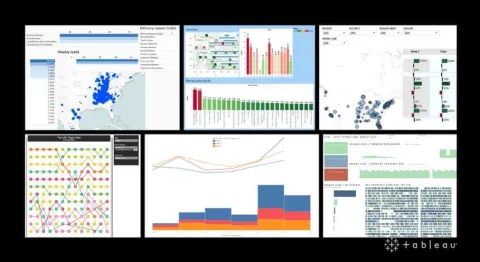
In its most distilled form, data visualization is simply the presentation of data visually to highlight key findings and shed light on actionable insights. Some examples of data visualization include:
Considered both a science and an art, data visualization has a rich history stretching back to maps, graphs and the first pie chart invented in the 17th century. Of course, the introduction of computers and digital technology increased the possibilities for data visualization exponentially.
Data visualization empowers viewers to understand and act on insights quickly. In addition to increasing efficiency, data visualization helps people:
- Identify relationships and patterns: data visualization tools can clarify how various aspects of a business or the marketplace affect other aspects, illuminating organizational areas, relationships or patterns that need increased attention.
- Forecast emerging trends: data visualization can point to forthcoming company, marketplace or consumer norms by depicting historical and present data in graphic, understandable ways.
- Produce brand messaging: companies are always looking for ways to attract and retain customers, and data visualization can help. Through eye-catching images and engaging depictions of data, marketers and advertisers can share their company’s stories in a way that’s easy for the public to interpret.
While the information that data visualization presents may be complex, the resulting image does not have to be. Across a range of industries such as automotive, service and security, data visualization produces concrete results that benefit executives, employees and the economy.
Data Visualization in the Marketplace
With its varied uses and clear, positive effect, data visualization is a go-to technique for successful leaders who want to keep their organizations growing, efficient and innovative. From an automobile titan anticipating customer needs to a business services corporation creating an optimal work environment for employees with disabilities, data visualization makes a real-world, positive difference for companies, their employees and their customers.
Nissan: Empowering Local Sales through Democratized Data Access
Source: Tableau
Danielle Beringer, Regional Data Officer, North America at Nissan needed a life raft amidst the “sea of spreadsheets” she and the company found themselves floating in a few years ago. Nissan had large amounts of data that covered everything from customer engagement to employee productivity, but they lacked a way to visualize and comprehend the data in effective, meaningful ways.
Enter Tableau and Tableau Blueprint, tools that Nissan leveraged to drain their sea of spreadsheets and build an enterprise data culture in its place. Through data visualization tools, Nissan provides visual analytics to employees at headquarters, in the supply chain, across every American Nissan or Infiniti Dealership and at affiliate locations. The analytics cover key business elements like sales effectiveness, vehicle delivery and online customer interactions.
As a result of data visualization, Nissan has seen multi-million dollar savings and reduced warranty claims by anticipating customer needs and vehicle maintenance.
“Tableau was the catalyst to help employees have that ‘a-ha data moment,’” Beringer explains. “That flicker of data cognition turning into deeper understanding was what Nissan needed for success in a digital world.”
DOSE Café: Improving Employee Experience and Scaling for Growth
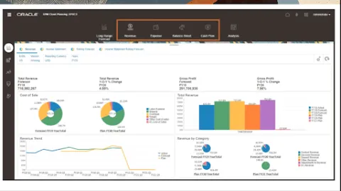
Source: Oracle
DOSE Café is a Saudi Arabian coffee franchise that features specialty beverages and prides itself on excellent customer service. They had a challenge to overcome in providing that customer service, though — manual transactions were taking up employees’ time, causing frustrations and reducing the amount of time that employees could spend serving customers. Additionally, manual processes for operations like payroll were causing errors and affecting employee morale.
Company leadership decided to implement Oracle Cloud ERP, Oracle Cloud HCM and Oracle Payroll to modernize its finance and HR operations. In doing so, they vastly improved their operational efficiency and improved employee satisfaction.
“For DOSE Café, a happy employee equals happy customers, which is what we really deliver — happiness and a good mood,” explained Chief Human Resources Officer Abdulaziz Alkhaldi.
One of the primary tools that empowered these improvements was Oracle Cloud’s integration with the company’s point of sale system, which provides managers with up-to-date sales information communicated through accessible data visuals. Additionally, the CEO and board members can make data-driven decisions based on the branch performance comparisons that Oracle’s data visualization tools provide. Thanks to these tools, DOSE Café payroll administration now has zero errors, empowering finance professionals and managers to focus on making the most of data insights in growing the company.
Pandora Intelligence: Building a Safer World
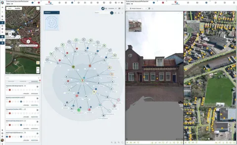
Source: Microsoft
Peter de Kock, founder of Dutch security and crisis intervention company Pandora Intelligence, believes that a strong narrative framework paired with real-time information and insights can bring about real, positive change when it comes to safety. That’s why the company uses artificial intelligence and machine learning to interpret data in storied terms, such as exploring protagonists and their motivations.
“It's not only about narrative structure, but also about cyclic learning and trying to grasp as many details as possible and using past knowledge to anticipate the course of action in the near future,” says Peter Rakké, Chief Technology Officer.
An essential component of this process is data visualization made possible by Microsoft products — Microsoft Azure, Microsoft Visual Studio, Azure SQL and Azure Machine Learning. With these data visualization tools, Pandora’s Intelligence platform rapidly analyzes critical data in the event of major emergencies, such as chemical fires, and provides meaningful insights to first responders.
When time is of the essence and lives are on the line, data that is visualized and understood in the context of the broader story — such as the nuances of a setting or the demographics of potential victims — isn’t just good for the bottom line. It’s crucial to keeping people and communities safe.
Become a Leader in Data Visualization
Are you interested in making sense of big data and presenting it in meaningful ways? Do you want to learn how to study the past in order to make the most of the future in business? If so, the Online Doctorate of Business Administration (DBA) - Business Intelligence at Marymount University will prepare you to demonstrate the importance of data visualization throughout your professional career.
The fully online DBA in Business Intelligence features in-depth coursework in data visualization and data strategy.
For example, Using Data for Business Intelligence covers the technological and management aspects of developing and using data to support advanced decision making. Students develop data strategies for the organizations of their choice and build a platform that provides data-driven business intelligence. They learn how to use state-of-the-art visualization tools and study how to present their visualizations in ways that engage consumers, promote business transparency and highlight the importance of data visualization.
Additionally, in a course called Artificial Intelligence Applications, online DBA students learn how to implement artificial intelligence to make the most of data. They study machine learning models and implement tools to support business intelligence using available data.
Through these courses and more, including an applied research project, online DBA students gain the data visualization skills they need to become strong leaders in the business world. The program is cost-effective and can be completed in as few as three years. Not only do students graduate with a valuable degree, but with a strong network of fellow students, alumni and faculty members.
Become a Business Intelligence expert with a DBA in Business Intelligence from Marymount University Online.